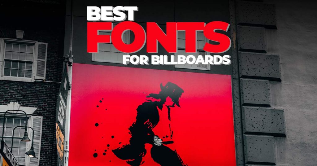
Typography plays a significant role in BillBoards so how to use typography or the best font for billboards could be tricky. Typography plays a critical role in billboard design. There are the Best Tips And Best Font For BillBoards.
Even if you have compelling content, adopting the improper typeface will prevent people from reading it. Here are some of the best typography advice for outdoor advertising to assist you to navigate the font maze.
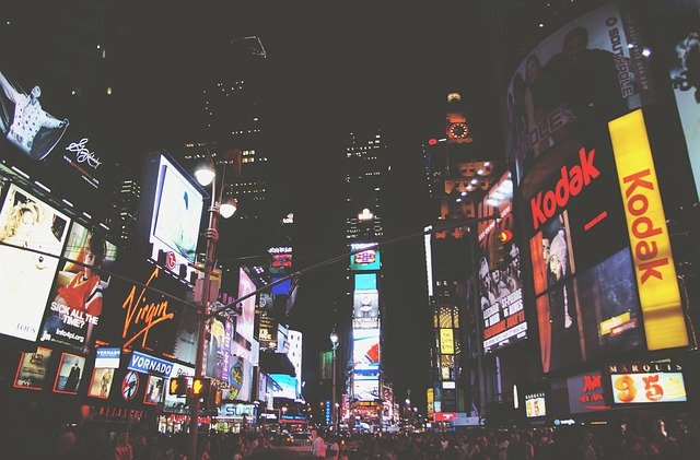
Firstly, The audience reading a billboard is usually driving past on a busy highway with hardly a few seconds to read and absorb the message on the billboard.
Here are a few billboard design tips for billboard typography. So, your typeface needs to be legible from a distance, and that limited time.
No matter how compelling your campaign, if those viewing your content can’t read it, they will walk on by without giving it a second look.
So, you need to make sure it’s clear for people to read and understand at a single glance because you have just 3 – 6 seconds to make your content count.
The four most important factors to consider for effective outdoor advertising typography are:
- Simple And Catchy Font
- Font Size
- Eye-Catchy Colour
Table of Contents
Best Fonts For BillBoards

Keeping in mind for Best Tips And Best Font For BillBoards the audience, your message must be legible at a distance of more than 1000 feet. Maintain enough distance between each letter. Letters that are too spaced out or too close will not make for an easily understandable message. So, we have to choose that which should be readable from far and close distance both.
Remember you have to convey your message through your text so there is no need to use fancy fonts. We also should not use fancy and thin fonts because they are difficult to read and understand from far place in less limited time.
So keeping in mind these things best font for billboards will be:
Helvetica

Helvetica is probably the most well-known typeface in the world. This font has a wide range of variants and is very versatile in the world of design. As we have said, the idea of this post is to introduce you to fonts that are clear and easy to read and Helvetica is a perfect example of this.
Bodoni

Bodoni is a serif typeface. Its creation culminated 300 years of evolution of Roman typography and emerged with great contrasts between thin and thick lines and an overall geometric shape.
Univers

Univers is one of the most successful typefaces of the second half of the 20th century. So much so that it is one of the most used typefaces in advertising and in the media. It´s clear, simple and legible, and incredibly versatile.
Gill Sans

Gill Sans is the typeface that is used on the Most Famous London Underground. It was created by Eric Gill and is a very versatile font with many different versions.
Avant-Garde
Avant-Garde is used by the most famous logo of Adidas, and it’s not surprising as the brand is responsible for really pushing this typeface which has now become one of the most well-known and easily recognizable of all.
Best Font Size For BillBoards

Use big font size to allow viewers to absorb the message from a far distance. Having unused visual space on your billboard is not recommended. An eye-catching slogan in the perfect typography is sure to arrest attention. Big fonts are not only legible but provide the advantage of occupying such white spaces. Putting too much text can turn the viewer off.
Best Colors For BillBoards
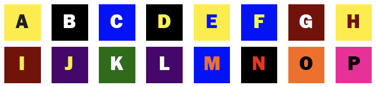
Bright and bold colors with a high contrast got more attention at all times of the day. We should not use soft pastels from the color palette for a billboard design.
Shades of bold colors like green, black, red, yellow, or orange can be used to create contrasts.
Choose colors keeping in mind the image used in the board. Bold and bright colors, in contrast, will create an appealing billboard.
Conclusion
Most importantly simplicity is the key and design should be easy to read. These were some best tips and Best Font For BillBoards.
Keep Learning:
How To Make Banner Ad Or Poster Design For BillBoards Or Social Media Ads.
Watch Video For More Info:

I’m a Graphic Designer with 5+ years of experience. Specialized in Adobe Photoshop.
Get Info About Any Photoshop Editing, Photoshop Manipulation, Logo Design, Flyers, Business Card, Cartoon Portrait and any type of work-related to Graphic Design and Photoshop Editing.

Good day! This is my 1st comment here so I just wanted to give a quick shout
out and tell you I genuinely enjoy reading through your blog posts.
Can you suggest any other blogs/websites/forums that deal with the
same subjects? Many thanks!
Откройте Авиатор для незабываемых увлечений
ладный вебресурс https://ukrtvory.ru/
viagra generico con receta precio generic viagra australia paypal [url=https://viagratopconnectt.com/]amazon viagra[/url] online pharmacy reviews viagra online viagra sales reviews
достойный вебсайт https://ukr.school-essay.ru/
[url=https://goodway.design/]разработка элементов фирменного стиля[/url] – прототипирование сайта, разработать дизайн упаковки
большой вебресурс https://fable.in.ua/
прекрасный веб сайт https://ukr-lit.com/
перворазрядный веб сайт https://biographiya.com/
красивый сайт https://schoolessay.ru/
KUBET ทางเข้า、KU หวย、หาเงินออนไลน์
https://9jthai.net
добродушный вебсайт https://goldsoch.info/
достойный вебресурс https://opisanie-kartin.com/
человечный вебсайт https://home-task.com/
хорошенький вебресурс https://ukrtvir.com.ua/
HostGator: HostGator is known for its affordable plans and reliable performance. They offer unlimited storage and bandwidth, a variety of hosting options, and excellent customer support.
DreamHost: DreamHost is a well-established hosting provider, known for its solid uptime and fast-loading websites. They offer a wide range of hosting options, including shared, VPS, and dedicated hosting. [url=http://webward.pw/]http://webward.pw/[/url].
Исследуйте воздушное пространство в игре Авиатор
2. Достигайте высоты в игре Авиатор
3. Наслаждайтесь приключениями в игре Авиатор
4. Станьте легендарным пилотом в игре Авиатор
5. Раскройте загадки глубин пространства в Авиатор
6. Найдите свое предназначение в игре Авиатор
7. Узнайте все о самолетах игры Авиатор
8. Готовьтесь к боевым полетам в игре Авиатор
9. Откройте для себя новые земли в игре Авиатор
Стремись к успеху и преуспевай в Авиаторе